Posts

Blog 15

Image
This is an award winning poster design for the movie Revenant done by Levente Szabo. The purpose of this poster is promote the artistic quality of the film and to get the viewer to relate the epic poster to the quality of the movie. The amazing illustration in this poster will engage the viewers into wanting to see the movie revenant.  I chose to do this because in my portfolio I chose to create a movie poster design so i could show my illustration skills and I used this as inspiration.  

Blog 14

Image
this is an editorial design for the visual playground festival. I found this on Behance.com. The purpose of this design is to show the expressive, fun and awe-inspiring workshops that are held at the festival.  The very vibrant color scheme shows us immediately how powerful and fun this event would be. They have accomplished what the goal of the design of a children book of fun and inviting but they also made it classy and mature. 

Blog 13

Image
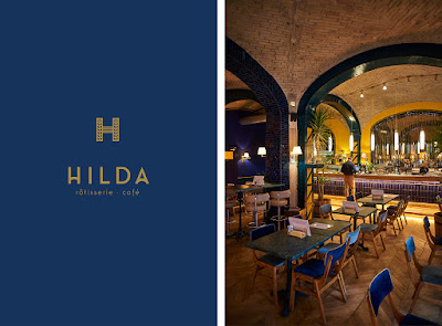
This is a branding campaign done for the Hilda restaurant. I found this on Behance.com from the trending and popular section. Just like any branding campaign, the purpose of this is to show the personality and feeling expressed by the company when looking at the designs. The choice of deep blue and clean gold lines give the customers the feeling of the contemporary but also hipster feeling. The designs are very classy but also inviting and fun at the same time.   

Blog 12

Image
This is a design and rebranding from LogoDesignLove.com. This logo doesn't say who made this but the purpose of this is to give the company a new face which would lead to the entire environment to be created and developed after the logo. The logo is playful but also very slick and modern. From what is designed, we can see how the company is going for a calm, professional, and playful but also clean branding. The colors also help give this impression by being not as vibrant as other logos that might also choose blue. 

Blog 11

Image
https://www.logodesignlove.com/images/architecture/albia-logo-animation.gif This is a Brand identity for the Client Albia.  This was found on LogoDesignLove.com and the function of this is to give the company an identity and feeling or glimpse of what the company is like through these designs.  I personally really enjoyed the presentation through all sorts of different ways to look at it.  I chose a couple different for the blog but there was many more.  I think the way that the designer chose to use color and style is a really good way to show us how professional and modern this place is.  Hopefully we can do the same on our upcoming branding and identity project.  

Blog 10

Image
This is a logo redesign for Coke made by Pedro Almeida. I found this work on layersmagazine.com. The function of this design is of course to be the "face" of the company and to make the customers recognize and to be familiarized with the drink.  This artist had the idea of taking famous and really well known logos and taking away everything that is unnecessary. Did he go too far? I think this will only work for major companies such as coke that already have the extremely well known logo and can be identified but I would have been very confused if this was a less known company.  

Blog 9

Image
This is a logo done for John & Jane, a technical event support company.  The logo is done by Bruges based Skinn and I found this on LogoDesignLove.com.  The function of this logo is to brand the company and to give the feeling and vibe that is felt when you receive their business. The logo is very clean, contemporary, professional and interesting. You can tell just from the logo that this is their personality just through the brilliant combination of the two J's. The color is also very prominent and stands out as unique.