Posts

Blog 10

Image
This is a logo redesign for Coke made by Pedro Almeida. I found this work on layersmagazine.com. The function of this design is of course to be the "face" of the company and to make the customers recognize and to be familiarized with the drink.  This artist had the idea of taking famous and really well known logos and taking away everything that is unnecessary. Did he go too far? I think this will only work for major companies such as coke that already have the extremely well known logo and can be identified but I would have been very confused if this was a less known company.  

Blog 9

Image
This is a logo done for John & Jane, a technical event support company.  The logo is done by Bruges based Skinn and I found this on LogoDesignLove.com.  The function of this logo is to brand the company and to give the feeling and vibe that is felt when you receive their business. The logo is very clean, contemporary, professional and interesting. You can tell just from the logo that this is their personality just through the brilliant combination of the two J's. The color is also very prominent and stands out as unique. 

Blog 8

Image
This is a logo done by Paul Belford and made for Waddeson wine. I found this on Logodesignlove.com. The function of this piece is to brand the company and to become an iconic and contemporary symbol of Waddeson Wine. It works very well at showing the style, values and feel when you buy from Waddeson wine.  The modern and extremely simplistic W and grapes are combined and simplified to create a wonderful and basic logo.  Also the presentation of the logo in different formats is a very appealing way to show the logo. This will be a good reference for the rebranding project we are working on. 

Blog 7

Image
This is a piece of work done by one of my good buddies, Jordan Bidner who went through parklands graphic design program. This is a skateboard graphic he did and his great illustrations are shown here.  The function of this illustration is to be a decoration or a sticker. You can make the argument that the function of this is to promote Jordans amazing illustration skills.  I chose this because of our current project doing the branding for Stormwater.  I liked this because of the great balance of thick and thin lines and the unity of curvy and fluid motions.  It is very symmetrical but it has variation which causes it to be very appealing and not boring.  

Blog 6

Image
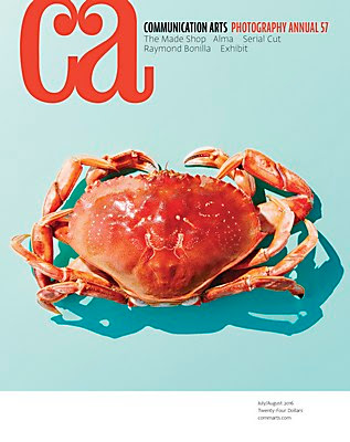
For this blog, I chose to do something a little different and look at the actual magazine covers of the communication arts covers.  I found these on their website and chose to do it because no one has done it and it shouldn't go unrecognized.  The function of this design is to captivate people into wanting to open this up and see the top designs of the time.  It has done this very well by using clean and appealing type, a unique and captivating logo and very clean artwork and designs used for the front cover.  The covers of all of them are also very good at being unified, as they have the same layout, but they are also different causing variety.  The color schemes of type are perfectly matched with the image and the colors are changed  according to the design or picture used.  I chose this because of how I am currently working on making the billboards into three unique but unified works.  

Blog 5

Image
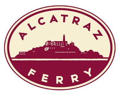
This was a logo design done by Michael Schwab, found in Communication arts. This caught my eye because of our current project for logo logo redesign.  The function of this logo is to brand the company that it is representing.  It should give the feeling and fit the personality of the Alcatraz Ferry just by how it looks and through color choices.  I really enjoy the simplistic logo that is made and becomes a very good visualization of what the identity of the Red and White Fleet is like.  They do this through soothing and calm colors, but very contrasting. The two colors are not vibrant and outgoing and make us think of this as more classy and professional.  I believe that this logo has a very excellent mix of classy, professional and modern elements that made it stand out to me. 

Blog 4

Image
This is a poster for the juried art and design competition made by randy clark. I found this online on the design annual. The function of this poster was to promote art and design and they did it perfectly.  They chose to take an iconic piece of artwork and use design and digital elements to make it a perfect combination.   I personally enjoyed this piece for the simplicity and how they chose to make the picture the main focus of the poster and then the words are very small but you eventually read the title and it all makes sense.