Posts

Showing posts from September, 2017

Blog 5

Image
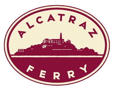
This was a logo design done by Michael Schwab, found in Communication arts. This caught my eye because of our current project for logo logo redesign.  The function of this logo is to brand the company that it is representing.  It should give the feeling and fit the personality of the Alcatraz Ferry just by how it looks and through color choices.  I really enjoy the simplistic logo that is made and becomes a very good visualization of what the identity of the Red and White Fleet is like.  They do this through soothing and calm colors, but very contrasting. The two colors are not vibrant and outgoing and make us think of this as more classy and professional.  I believe that this logo has a very excellent mix of classy, professional and modern elements that made it stand out to me. 

Blog 4

Image
This is a poster for the juried art and design competition made by randy clark. I found this online on the design annual. The function of this poster was to promote art and design and they did it perfectly.  They chose to take an iconic piece of artwork and use design and digital elements to make it a perfect combination.   I personally enjoyed this piece for the simplicity and how they chose to make the picture the main focus of the poster and then the words are very small but you eventually read the title and it all makes sense.  

Blog 3

Image
I chose this package redesign from communication arts made by Naomi Hui for Campos Reales.  The function  of this bottle is to attract the eye of adults and is made to show something very mature looking.  One of the reasons why I enjoyed this work so much is for its negative space used in the animals that act as the leaves of the tree.  The black surrounding each animal gives the animals a much cleaner and less crowded look even with so many animals.  The work has a very modern and new look to it making it appeal to the more mature consumer.  

Blog 2

Image
These are some logos from logolounge.com that I found and was very intrigued by.  The purpose and function of the logos here are to appeal to the target audience and also to be creative.  The logos are very stylized and bring attention to what the company or logo is used for.  Just from the logos, we can tell the style or what the audience they are trying to appeal.  The other logos/designs are very creative and allow our brains to be blown away by the mix of words and images in order to create a successful design.