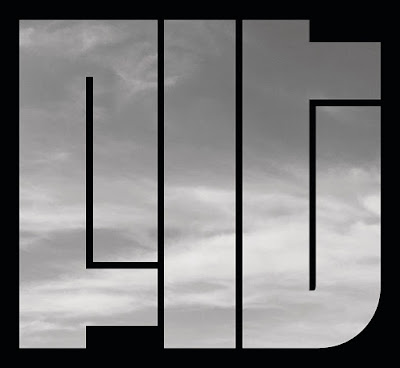
This is a typeface made to fit in any space and to fill in as much negative space as possible. I found this typeface in communication arts, made by David Ross. The function of this type face is to communicate very subtly through the hard to read type. It can function as a interesting design layout also. I chose this for its very unique way to display type and in a very visually impactful way. This type, also very hard to read , is very interesting and has a great sense of negative space. Not as practical and applicable but it does have a very loud and bold feel to it that attracted me to it when I first saw it.


Comments
Post a Comment